
QUT Pocket Guide
I was tasked with refreshing the look and content of the Queensland University of Technology (QUT) pocket guide, which serves as a quick reference point for some of the key services that the university offers students. It is distributed as part of new student onboarding during Orientation Week, and is available year-round at the libraries and student help centre. The refresh was requested as the old pocket guide strictly followed the QUT corporate branding, and as such was very text-heavy and plain in colour, which was not very engaging to new students, who are often as young as 17.
Based on this information, I refreshed the colours to be brighter and more welcoming, and coordinated different colours to different services for easy identification. The visual style was also overhauled to be illustrative and friendly. This approach ended up overrlapping substantially with a redesign of the internal shuttle bus signage that was happening around the same time, so the projects ended up borrowing lots of ideas from each other and strengthening the overall presentation and messaging.
The refresh was highly regarded by the marketing and engagement teams, and over 12000 copies of the pocket guide were distibuted to new students in 2025.
Scope: Credit Card Fold Flyer
Tools: InDesign, Illustrator
Team: Queensand University of Technology
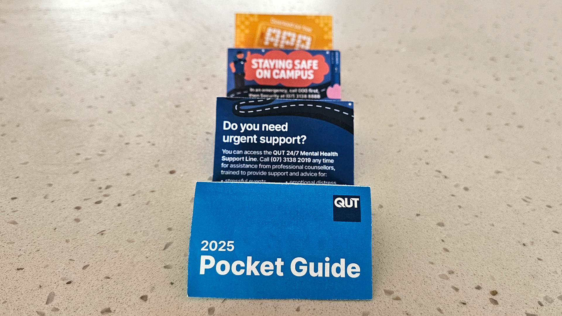
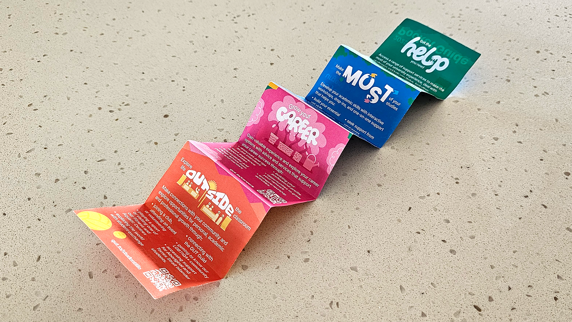
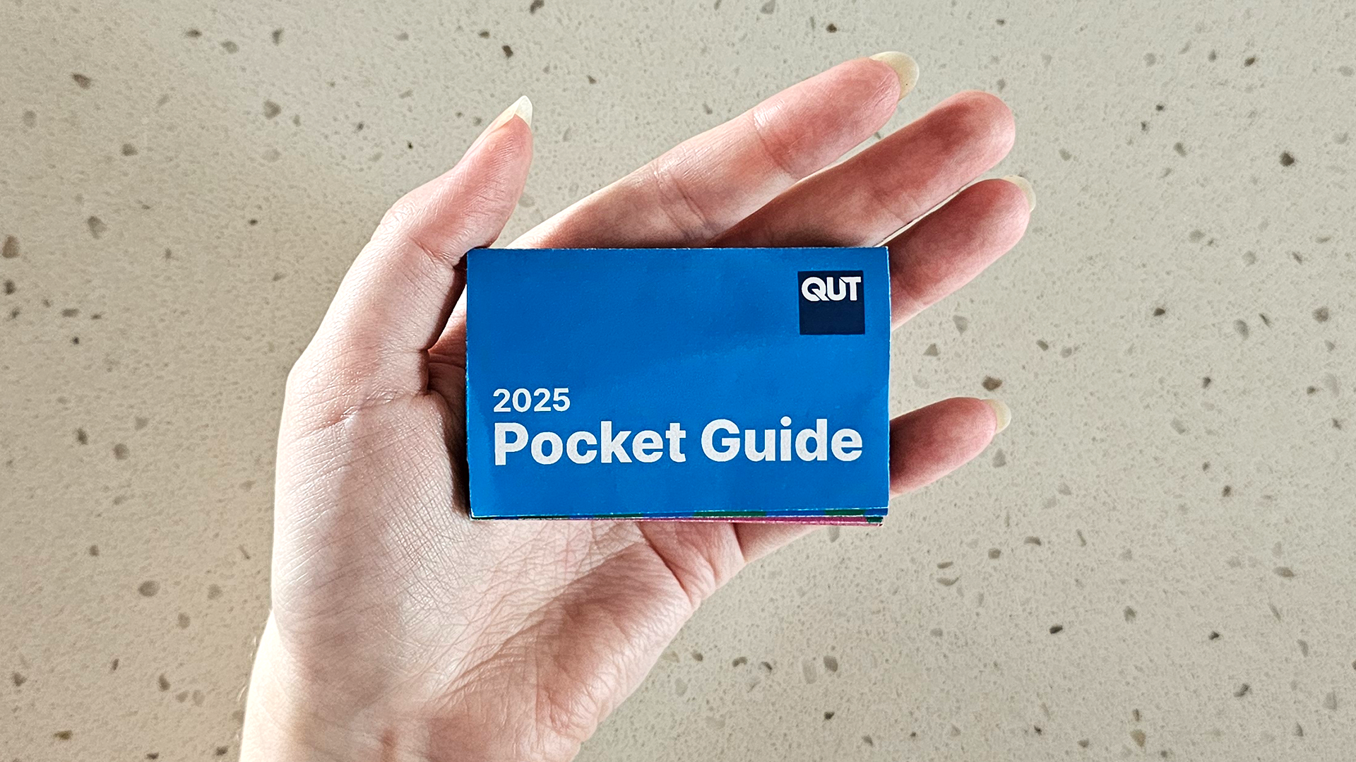
The pocket guide was designed to fold down to credit card size for easy transport.
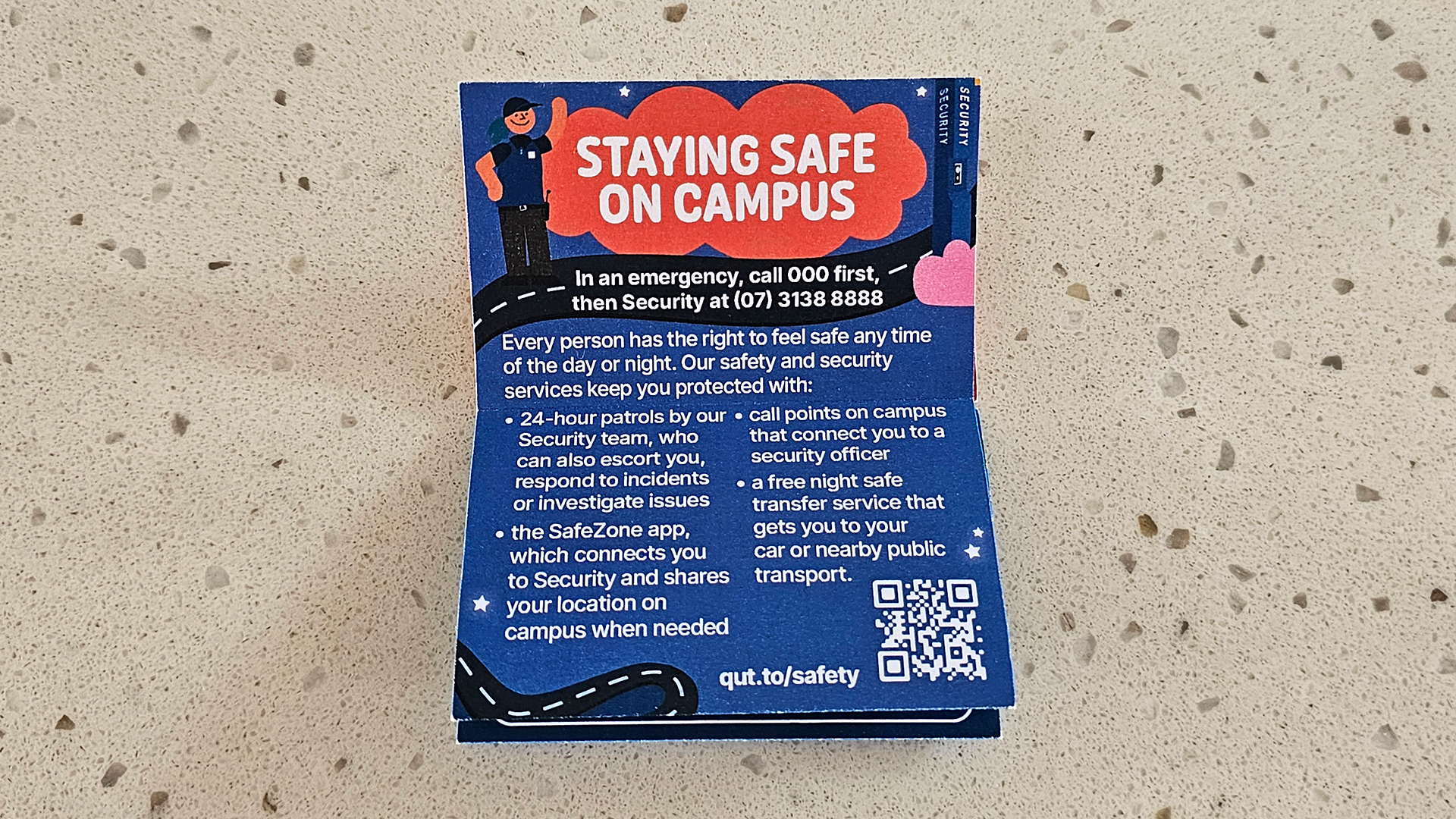
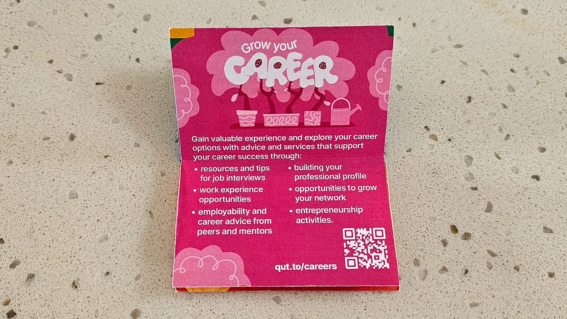
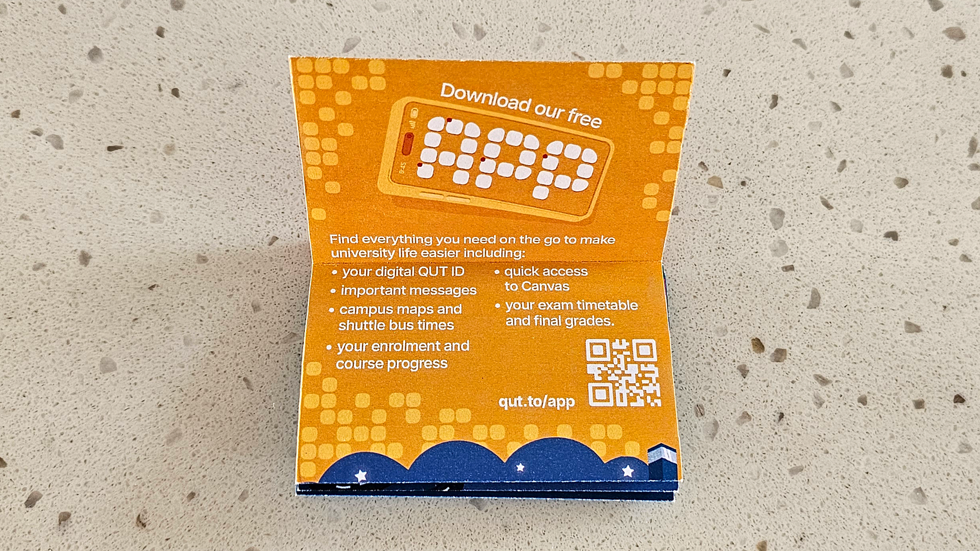
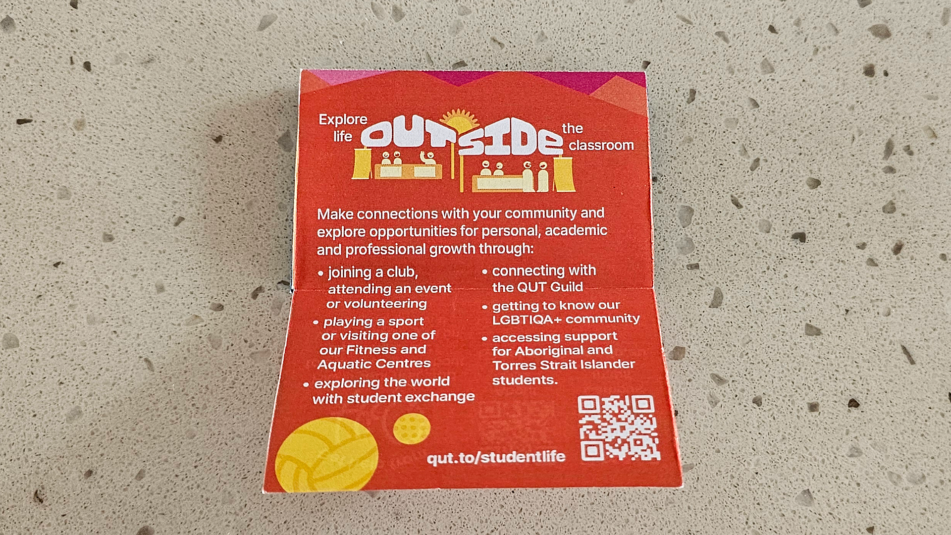
Video of the pocket guide.